The idea was inspired by threadwork, pastel shades, and simple graphics. The art direction of the designs follow a simple theme with uncomplicated graphics, delicate type and pastel colors that compliment the brand.
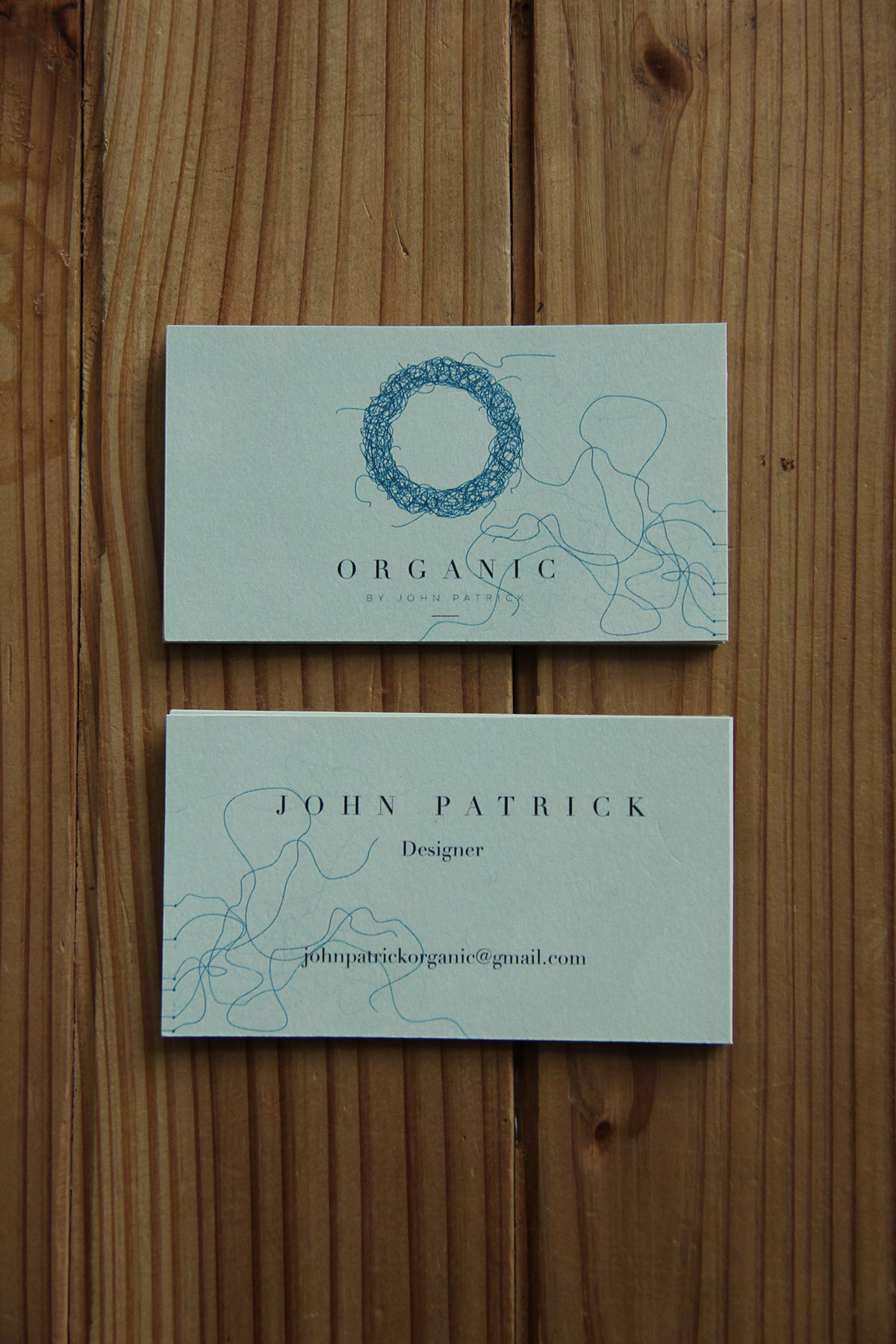
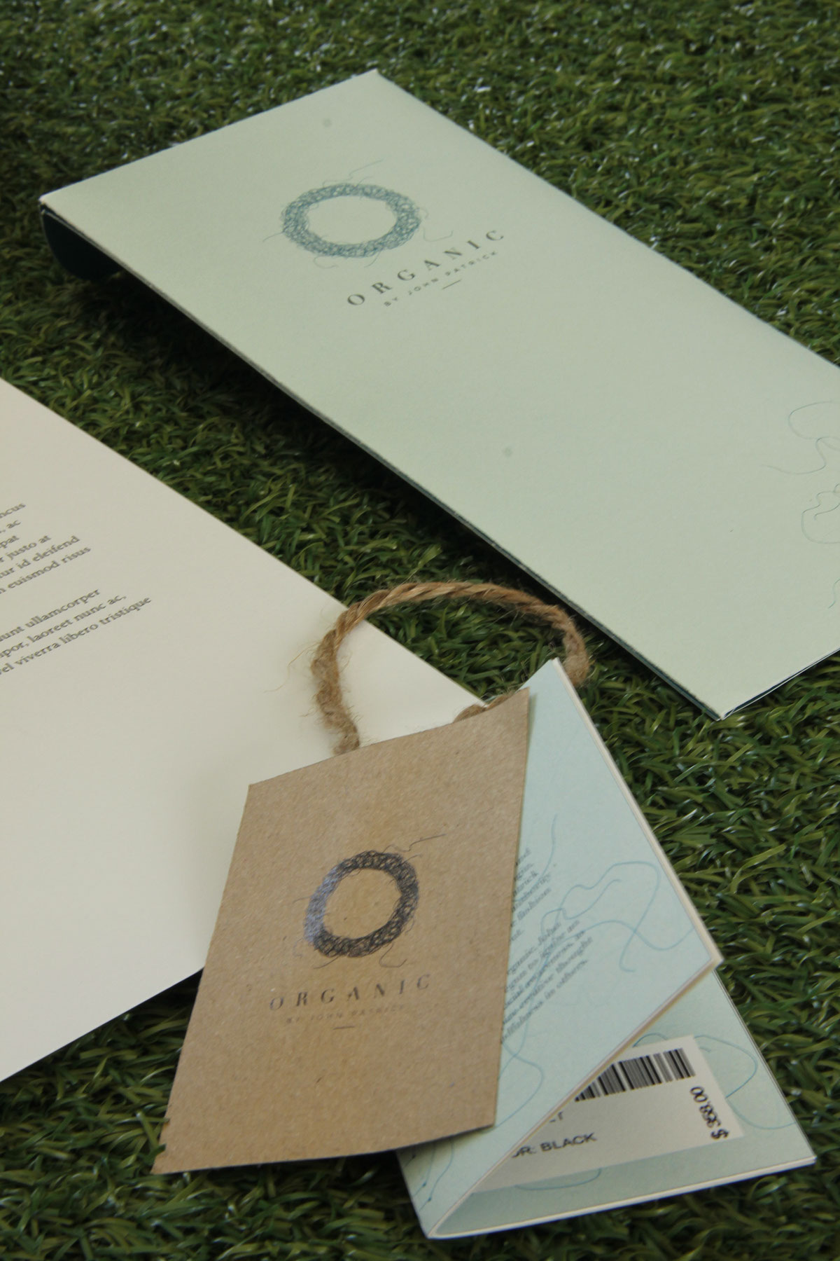
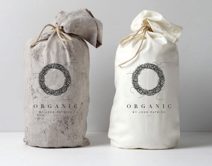
It was decided that the color scheme would be pastel shades such as mint, light pink, etc. Materials such as jute, handmade paper, were the inspiration. The final logo created was inspired by threadwork. It had to be simple, elegant, yet have a raw feel to it. After practical experiments involving different kinds of stitching techniques etc, the most suitable logo was finalized, which could be represented well graphically too. The shopping bags were drawstring bags with jute rope ties. The shipping packaging box to have a band with thread details and logo, running around it. The retail tag was designed as a booklet, with information on the garment or collection provided along with the barcode, price etc. on different pages. The letterhead, envelope and business card designs were simple and clean layouts, using thread patterns and the logo.